Illuminate Your Insights: Transforming Data with Azure Monitor!
The beauty of data lies in its ability to tell stories, and Azure Monitor serves as your trusty guide in this journey. With its robust analytics capabilities, Azure Monitor allows you to gather and analyze telemetry data from various sources. Imagine having a clear overview of your applications’ performance, user behavior, and system health—all in one place! By configuring Azure Monitor to collect log data, you can seamlessly observe trends and patterns that might otherwise go unnoticed. For a deep dive into setting up Azure Monitor, check out the Azure Monitor documentation.
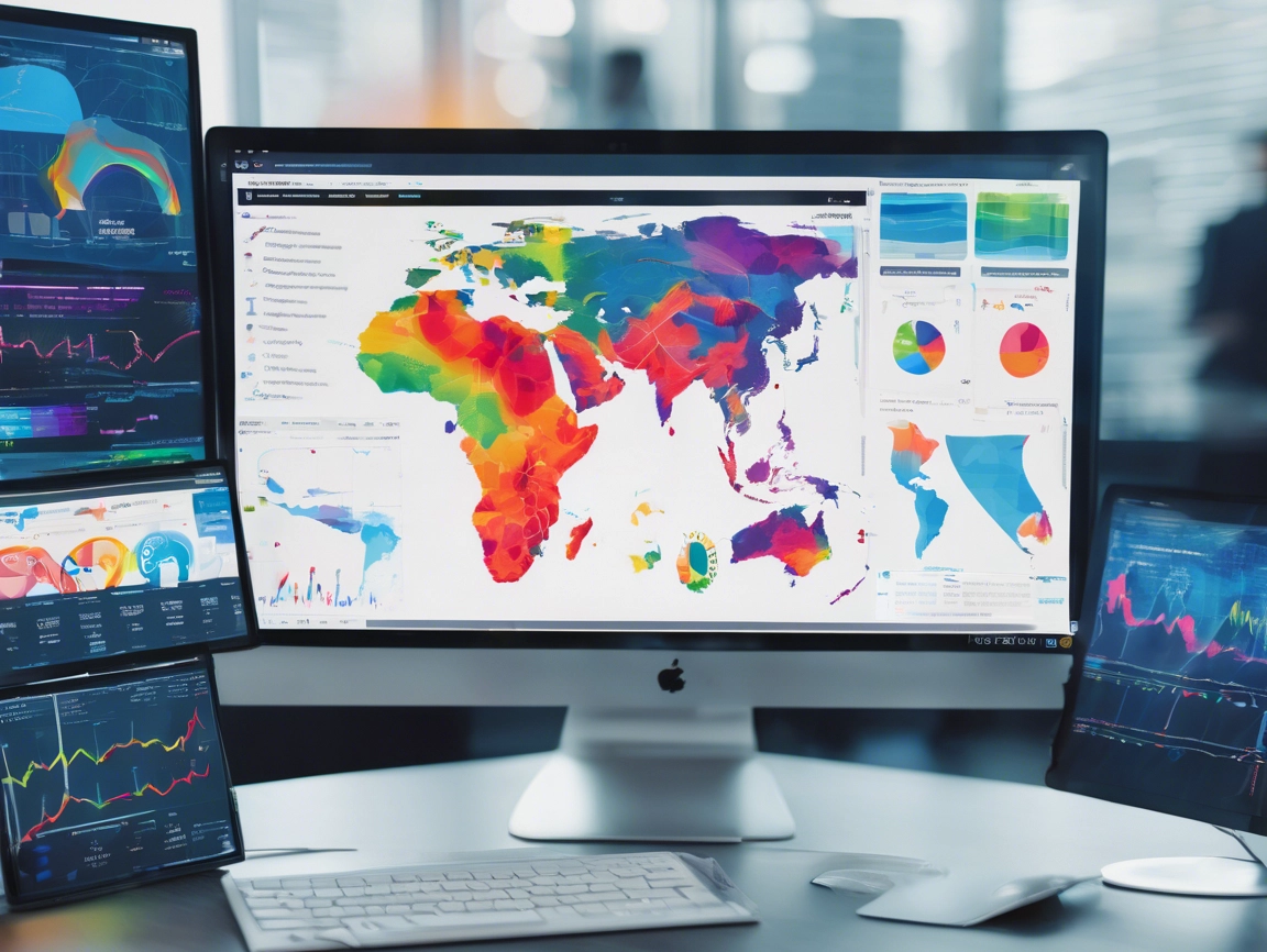
Once you’ve gathered your data, the next step is to transform those insights into compelling visualizations. Azure Monitor offers a suite of tools, like Azure Dashboards, that enable users to create stunning visuals with minimal effort. By utilizing charts, graphs, and maps, you can effectively communicate complex information in a simple and digestible format. This clarity not only enhances your understanding of the data but also fuels collaboration among teams, allowing everyone to work with the same clear vision.
Moreover, with Azure Monitor’s integration with tools like Power BI, you can elevate your data storytelling to new heights. Power BI’s rich visualization options allow for interactive reports that can be tailored for specific audiences. This means that whether you’re presenting to a technical team or upper management, you can create visuals that resonate with your viewers. To learn more about integrating Azure Monitor with Power BI, navigate to the Power BI documentation.
Paint Your Cloud Canvas: Bright Visualization Techniques Await!
Now that we’ve illuminated our insights, let’s explore some bright visualization techniques that can transform your data into an eye-catching masterpiece! One technique worth considering is the use of heat maps to visualize metrics, such as workload distribution across servers. By employing color gradients, you can quickly identify hotspots and potential bottlenecks, ensuring that your infrastructure runs smoothly and efficiently. It’s like having a temperature gauge for your cloud, helping you make informed adjustments!
In addition to heat maps, consider utilizing time series graphs to track performance over time. These graphs can help reveal trends and anomalies, allowing teams to identify peak usage hours or unexpected drops in performance. With Azure Monitor’s ability to customize time frames and data intervals, you can tailor these graphs to reflect the most relevant data for your needs. This flexibility lets you zoom in on specific events or view long-term trends, creating a dynamic perspective on your data.
Lastly, don’t overlook the power of storytelling through dashboards. By crafting a dashboard that encapsulates key performance indicators (KPIs) and vital metrics, you can create a comprehensive view of your cloud environment at a glance. Using Azure Monitor’s dashboard features, you can include various visualization types—such as pie charts, bar graphs, and line charts—ensuring that your data is not only informative but also visually appealing. To start building your own dashboards, visit the Azure Dashboard documentation.
As we wrap up our exploration of brightening up your cloud with Azure Monitor, it’s clear that effective data visualization is a game-changer for organizations looking to harness the power of their data. By illuminating your insights and employing vibrant visualization techniques, you can transform raw data into powerful narratives that drive strategic decisions. So, don’t let your data sit in the shadows—get creative, embrace these visualization tools, and paint your cloud canvas with clarity and color! Remember, the brighter your data shines, the better equipped you are to navigate the clouds of uncertainty in the digital world. Happy visualizing!


